It has never been easier for agents to create professional-looking collateral pieces to market their business. With digital tools like Canva, agents can design business cards, flyers, presentations, and social media posts that have a professional look and feel without the expensive price tag.
Canva offers two subscriptions, Canva Free and Canva Pro (paid). While Canva free provides a wide range of options for photos, templates, and graphics, Canva Pro features an even larger asset library and additional tools such as background remover and magic resize for a low yearly subscription of $120. If you produce a high number of collateral items or like to continually change things up, a Canva Pro account might better fit your needs.
As a designing tool, Canva is also very user-friendly, which is great for beginners to dive right in and start designing. Here are a few features to take advantage of when you’re working in Canva.
Start With a Template
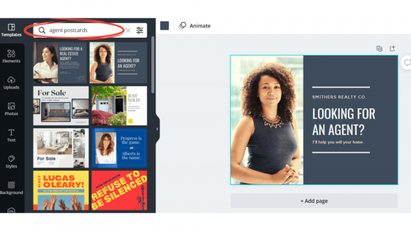
Canva has hundreds of templates available to choose from for any collateral piece that you are looking to create. Starting with a template will save you time and energy when trying to come up with a professional look and feel. Canva templates are completely customizable to your brand’s colors, fonts, and logo. You can also customize print sizes or choose a pre-existing size format. To narrow down the options, search through the templates by categories.
Another tip is to choose a category, then click on the first choice, “create a blank …” and a list of templates will show up in the sidebar that you can scroll through. This makes it easy to view and try out different templates until you find one you like. Keep in mind that you are using the template as a layout guide. The actual pictures or elements that are originally displayed will be replaced with things related to your theme or brand.
Customize Your Template Using Elements
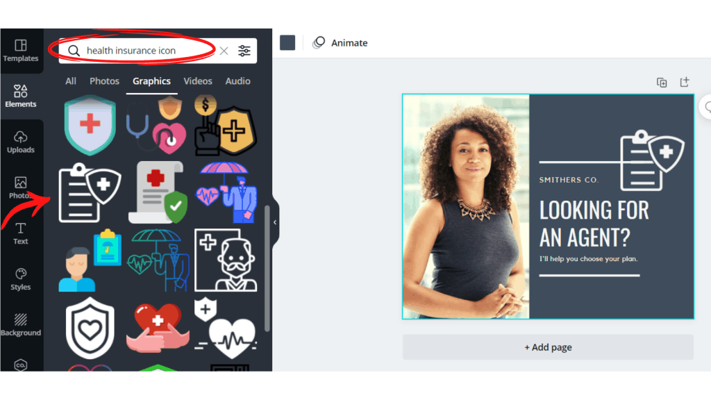
Once you are working in your template, use the “elements” tab in the sidebar to add your unique touches to the design. Swap out different elements in the template design with items that fit your brand and theme. Canva offers thousands of different element designs, from a fully comprehensive choice of icons to pictures, frames, grids, and graphic symbols. Many elements can be customized with your colors, cropped, flipped, or overlayed.
The elements library is quite vast, so use the search bar tool to find a specific style of an element. For instance, if you are looking for an icon to represent health or medical, instead of searching for a generic term like “health” and having 300 items show up, try “health insurance” or “health insurance icon.” The more you can narrow your search to specific keywords, the faster you can find the item that fits your vision.
Remove a Picture Background With One Click
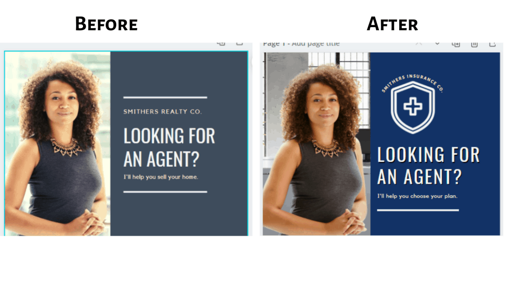
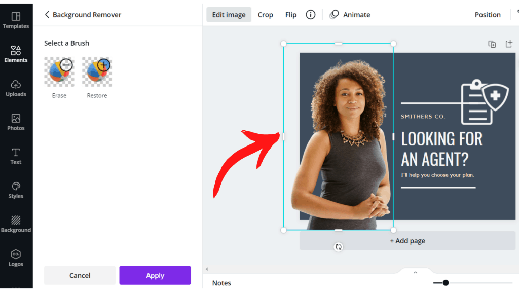
(*Canva Pro) You’re working on designing your postcards, and you have the perfect candid photo to use as your headshot, but the background doesn’t fit the look or theme of your layout. One of the best design tools Canva offers is the “background remover” feature. With one click of your mouse, you can change the background of a photo to transparent and then overlay it onto any design.
To use this feature, click on the photo you want to edit, and a toolbar will appear above your design. Click on “edit image,” and the “BG Remover or Background Remover” tool will appear in the side panel. Click on it, and it will automatically remove the background. This tool works best when the photo’s subject has a clear and solid form to keep the image from any distortions.
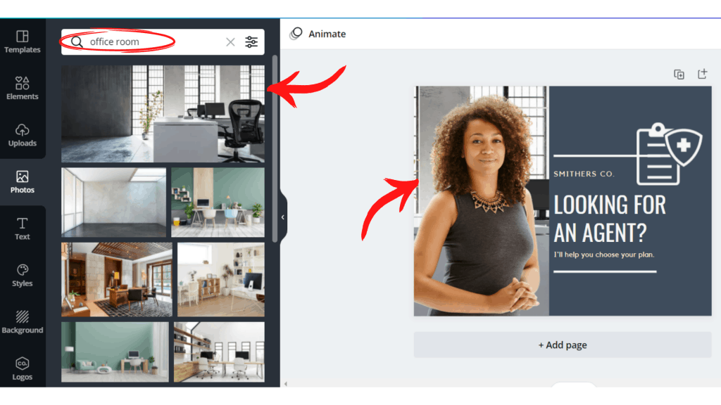
If there are multiple objects in the photo or objects that are smaller, spaced apart, or faded/blurred in areas, the background remover may have issues distinguishing between the background and main image. After you remove the background, you can overlay the image over any new background of your choosing.
Use the Spacing & Effects Tools to Make Text Stand Out
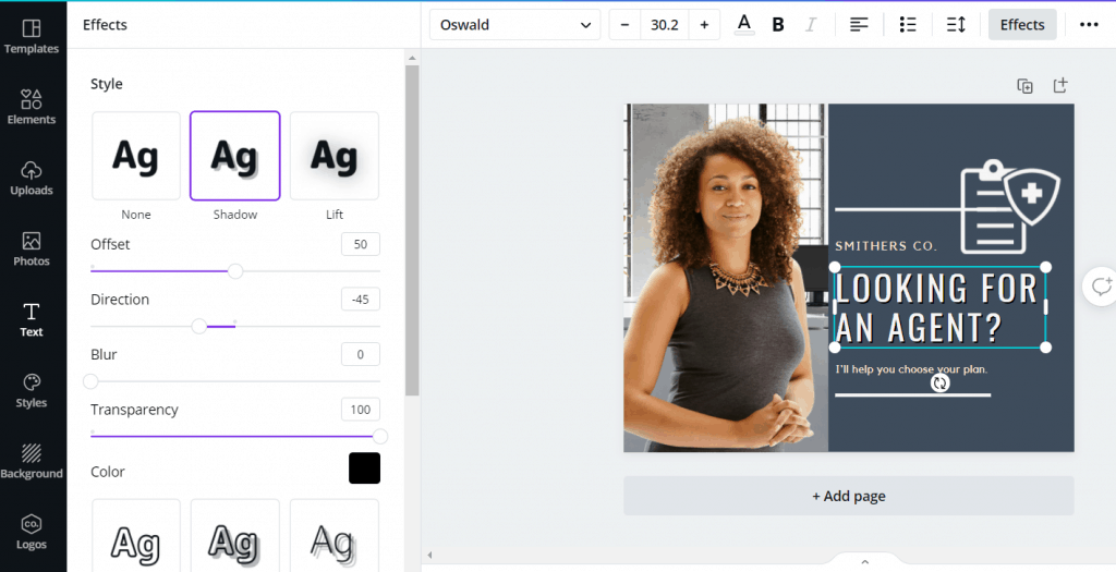
Certain parts of your text should automatically draw the eye. Highlight important parts of your text, like your headlines or name, using the “spacing” and “effects” tools in the toolbar that appears at the top of your design when working on a text. You can adjust the spacing between letters and between rows to flow more naturally in your design. Play with shading styles and bend words around shapes through the effects tool.
This can be an especially useful tool when creating logos, business cards, flyers, or Facebook posts. When working with lighter backgrounds, use dark or black shades to make the text pop. A tip for darker backgrounds is not necessarily to go lighter with shading. Using black shading with lighter text on a dark background can make your text appear sharper.
Canva can easily become an essential tool in your marketing efforts. Producing quality material with a professional look and feel will help you stand out from your competitors. Keep a lookout for future blogs about further tips on designing in Canva.
